GUEST POST
GUEST POST
5 Best Practices for eCommerce Navigation 2022
Making your eCommerce site convenient for digital shoppers should be your top priority if you really want to convert visitors into buying customers.

Safeeda MS
Dec 21, 2022


Safeeda MS
Digital Marketing Specialist with hands-on experience in SEO, Content Writing, Google Ads and Google Analytics.
Making your eCommerce site convenient for digital shoppers should be your top priority if you really want to convert visitors into buying customers. Regardless of whether they access your store via desktop, mobile, or tablet, you need to give them a responsive design, and importantly, consumers should be able to hunt out their preferred products within seconds. Hence, your eCommerce navigation must be intuitive and consistent so it causes visitors no frustration.
Why eCommerce navigation? Here are some beneficial impacts that all store owners should be aware of:
A clean and clear site structure creates better UX.
An enjoyable shopping experience that keeps shoppers staying longer in your store to drive more sales.
Improve search engine optimization (SEO), which means your online store will gain higher rankings in SERPs.
And after all, eCommerce navigation will get people to find and buy more products. Now let’s see what it is and how to deploy it effectively.
What is eCommerce Navigation?
eCommerce navigation is such a broad term. Your store is certainly rich in content like product details, purchase history, payment methods, FAQs, contact information, and so on. All of them should be logically placed in a way that makes sense to your customers. This is the purpose of eCommerce navigation. In short, it is all about how you design and arrange your site elements to enhance product discovery and customer experience.
Best Practices to Optimize eCommerce Navigation in 2022
eCommerce navigation has a considerable impact on the shopping experience which contributes to metrics like time on site, bounce rate, conversions, search ranking, and so on.
Make Your Navigation Menu Stand Out the heading is not indicative of what’s to follow
Parent Categories probably a clearer header would work
Designing user-friendly category navigation is the very first step that online merchants should focus on. To do it, make sure that visitors can see your main navigation bar with the parent categories near the top of the page. For those who are not familiar with parent categories, this term refers to an entity used to organize a hierarchy of products. Skincare, for example, is a parent category, while cleansers and moisturizers are child categories.

Positioning the parent categories near the top of every page gives shoppers a directory of various departments of your store. (Source: SourceBMX)
Apart from the position, how you label your categories play a key role in eCommerce navigation. A practical tip here is to make use of keyword research tools like Google Keyword Planner to help you come up with popular search terms to name your categories. The keywords will also give store owners an idea of how to name the navigation bar based on customers’ needs.
It’s like finding the answer to the question: Why are they visiting your site? Hence, the more your site language makes sense to your customers, the faster they find their favorite products, and the higher ranking your site lands in the search engine results page (SERPs.)

Trilogy is a clean and natural skincare brand, founded in 2002 by 2 New Zealand sisters. The products are grouped into different categories so Trilogy decided to use a drop-down menu with the hover effect to avoid bombarding shoppers with too many fields on the navigation bar. (Source: Trilogy)
However, if your store has a large number of products that are divided into various groups, try not to complicate the navigation bar with too many categories. Instead, use the dropdown feature as Trilogy is doing. The dropdown feature is a great way to indicate that there is more to see without cluttering your homepage and overwhelming your customers with too much text.
Introduce Your Subcategories
Aside from the parent categories, don’t forget your subcategories. Let us first define what subcategories mean.
They will allow you to be more specific with some options to save space on your homepage, yet create the opportunity for more time on-site with enhanced click-throughs for better engagement metrics and conversions. A great way to do this is to program the hover method onto your site.
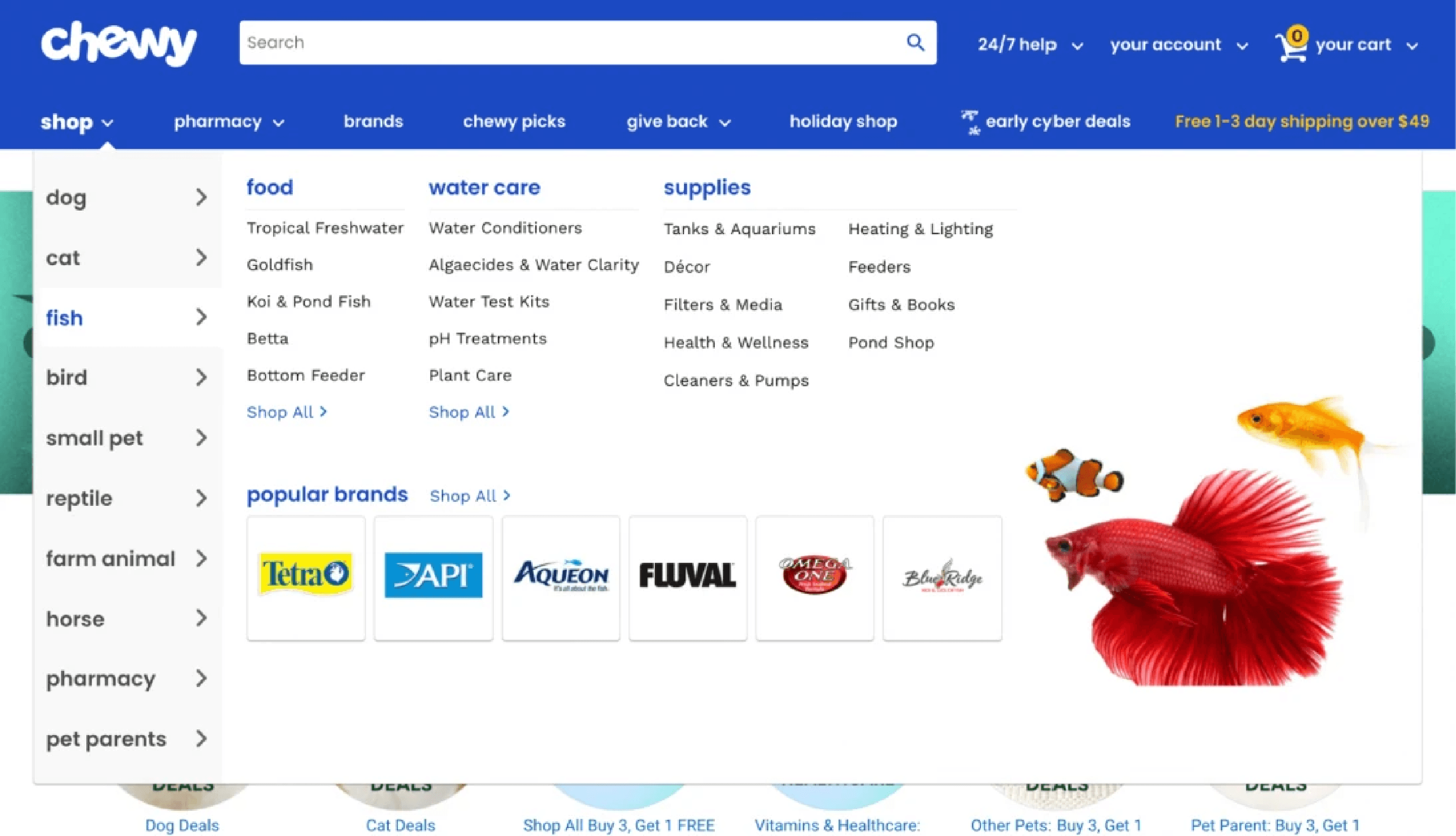
Chewy, a brand for pet supplies, allows pet owners to shop by pet type including dog, cat, fish, bird, small pet, reptile, farm animal, horse, pharmacy, and pet parents using a dropdown menu. Likewise, shoppers can see an expanded menu showing various products serving their pet’s everyday needs such as food, water, or health supplies when they hover their mouse over the subcategory. Hence, Chewy saves a vast amount of space on its page but still features all necessary items in a well-organized way that is easy to navigate.
Choose A Hamburger Menu On Mobile Devices
Did you know that in 2021, 72.9% of all retail eCommerce is expected to be generated via Mobile Commerce (m-commerce0, up from 58.9% in 2017? M-commerce is no longer a trend, it is a standard so brands should focus on enhancing the user experience on small-screen devices.
When it comes to responsive design, most eCommerce platforms resort to the hamburger menu, which is most recognized by the three horizontal lines. Let’s take a look at the navigation on Yummy Bazaar’s site.
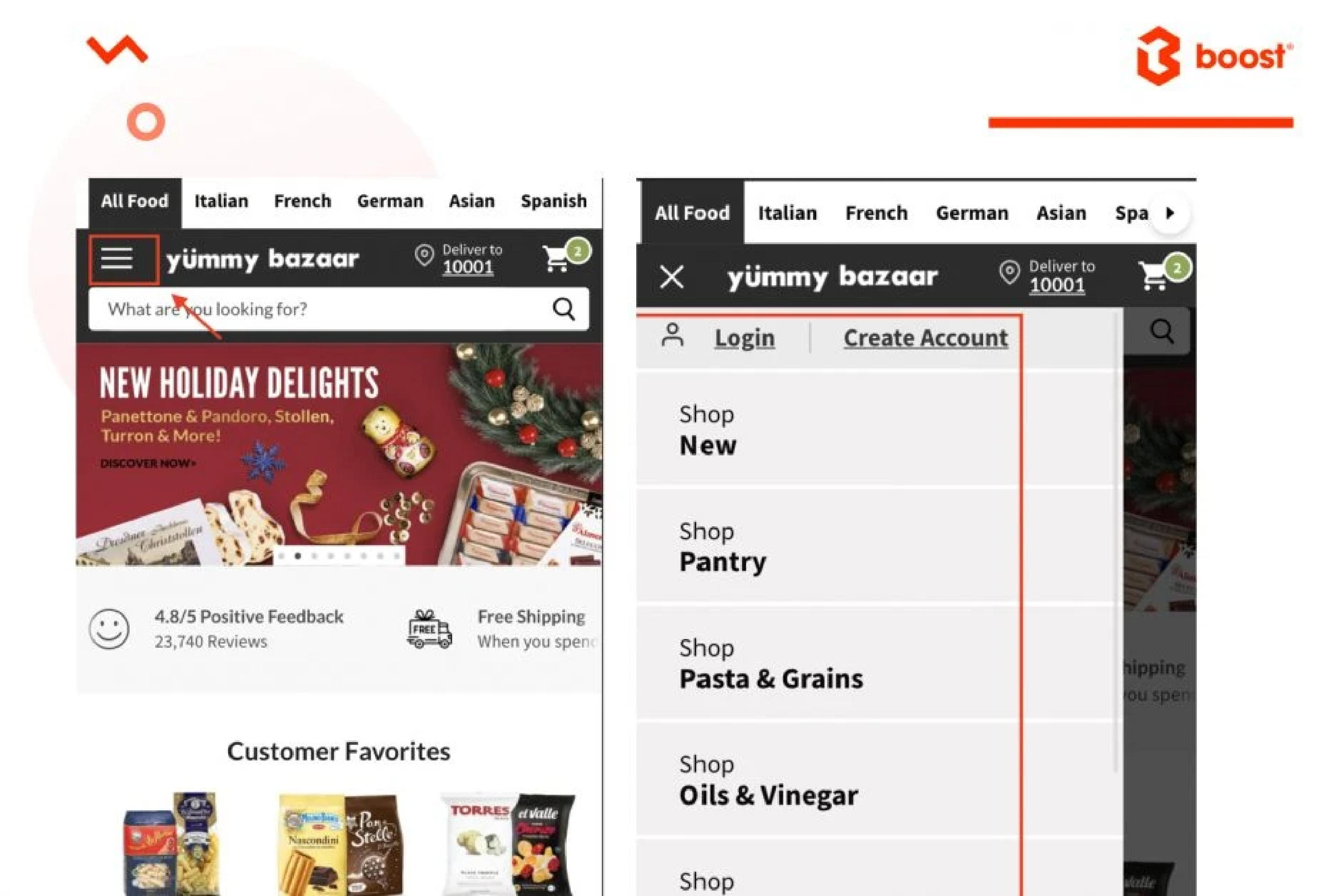
The use of hamburger navigation is to open and reveal several hidden menu options to make your page easier to read and less chaotic on mobile devices. Their layout looks clean and simple without the clutter of three-tiered navigation filled with drop-downs.
Put Your Clickable Logo In The Top Left of The Page
Logo plays a key role in the process of building your brand. However, have you ever thought that your logo is a standard tool that supports your store navigation and is not just for branding? Most Internet users expect and rely on the logo to return to the homepage. Hence, turn it into a Home button by making your logo clickable.

Headphone Zone, a brand selling headphones, earphones, and personal audio products, is an example here. No matter which pages their shoppers’ visit, they will always see a clearly-displayed logo on the top left of the page, and easily get back to the homepage with 1 click only.
Include A Noticeable Search Bar On Every Page
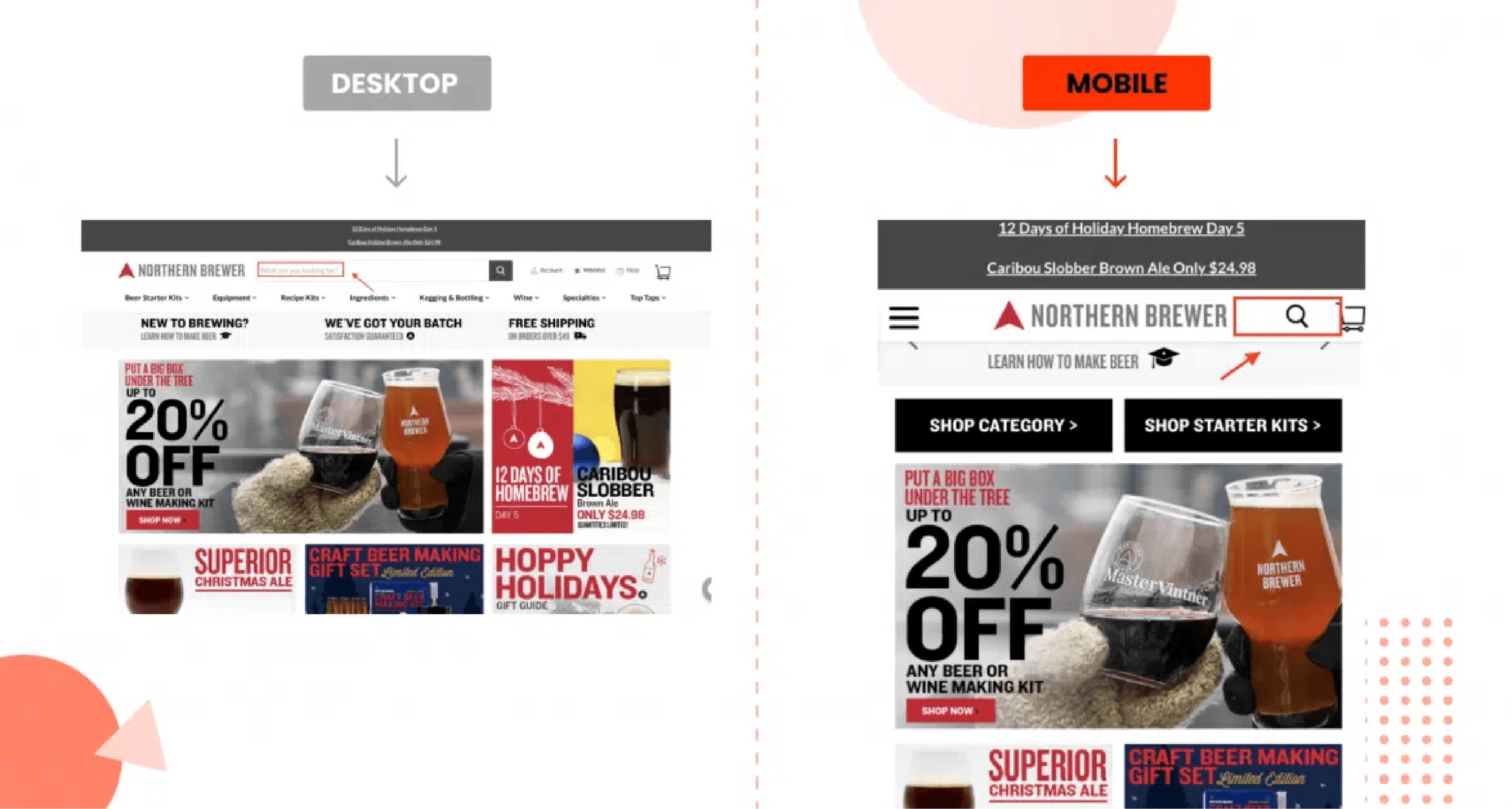
One of the more practical elements to optimize your site navigation is having a prominent search bar on every page for your shoppers to use. Place it prominently at the top of the page toward the center with a call-to-action (CTA) inviting visitors.
For example, ‘What are you looking for?’ like Northern Brewer does. This is a nice touch rather than including just the generic ‘Search’ prompt. Besides, having a magnifying glass for the search box is necessary to make it stand out, particularly on mobile devices.
What else can you do with your search box? Be creative by having it reflect your brand or the array of products that you offer.
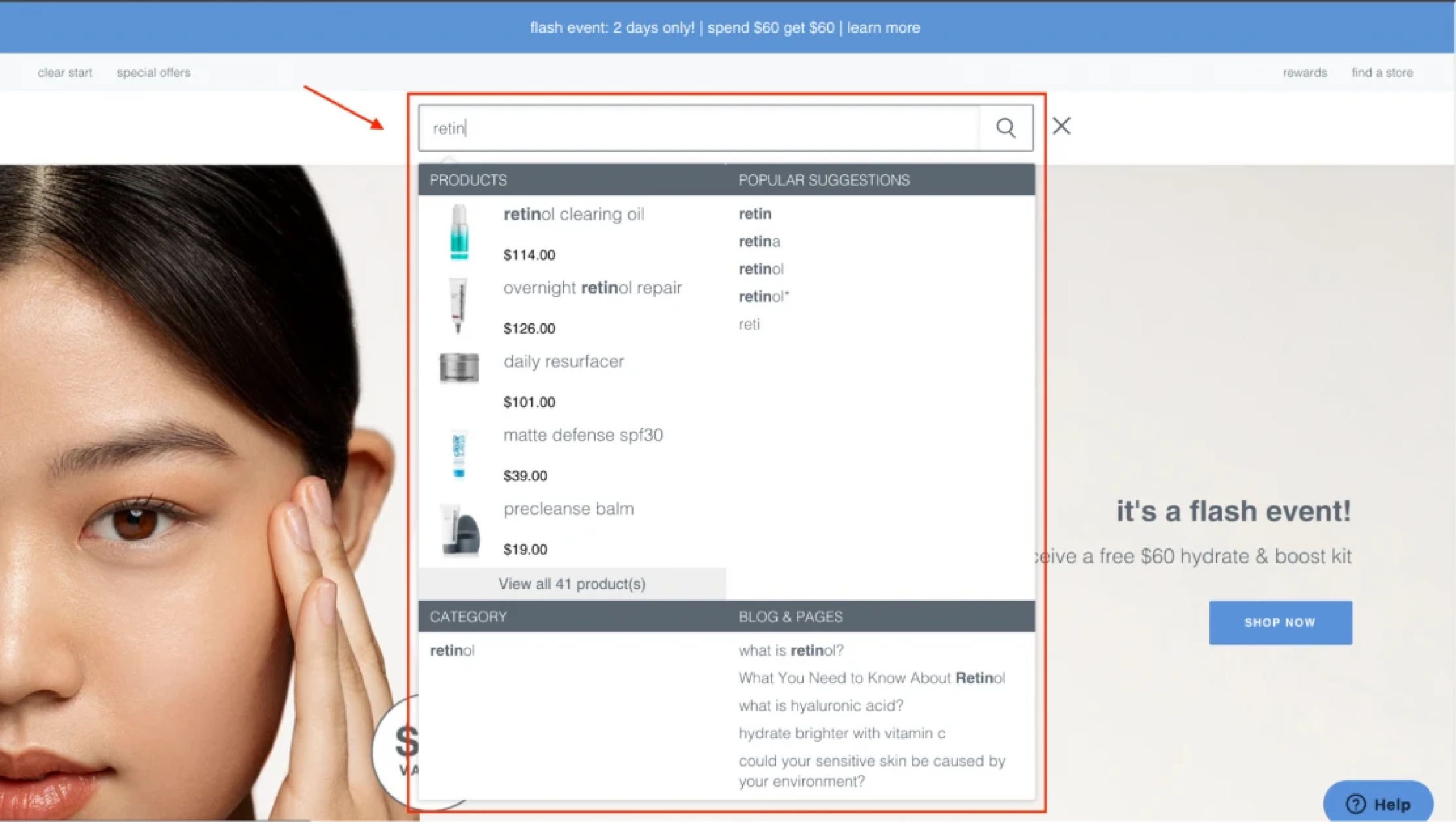
Take Dermalogica as a notable example here. The cosmetics brand eases their visitors’ search with autocomplete, which helps customers fulfill their search queries. The autocomplete feature saves them time while ensuring accurate search results so it fuels the probability of more conversions. Another tactic to apply is displaying popular searches or trending items to avoid no products found, and introducing them to what you have. You can also choose to showcase related collections and pages aside from products in the instant search widget as Dermalogica lists out some user guides to retinol.
Use Faceted Search (Guided Navigation)
Faceted search or guided navigation is not something new in the eCommerce game. Basically, this term refers to a filtering feature that allows users to refine search results by choosing from a wide variety of filters for product attributes. Therefore, online shoppers can find exactly what they are looking for faster and more efficiently.
Talking about faceted navigation, brands use facets to describe aspects of a product. Precisely, facets consist of filters made of attributes, which are usually pre-defined, based on each business’s specifics, and arranged into groups. Thus, facets can be used by all of your online store customers, but they are much more important for the ones who use search, as they remove the need for blind browsing.
Here are 3 examples of how you can leverage eCommerce navigation by using the faceted search on Shopify stores.

Mobexpert displays numbers next to facets to show how many products every filter has, both selected and unselected. Hence, it helps visitors to get a broader picture of what they can expect from the product catalog.
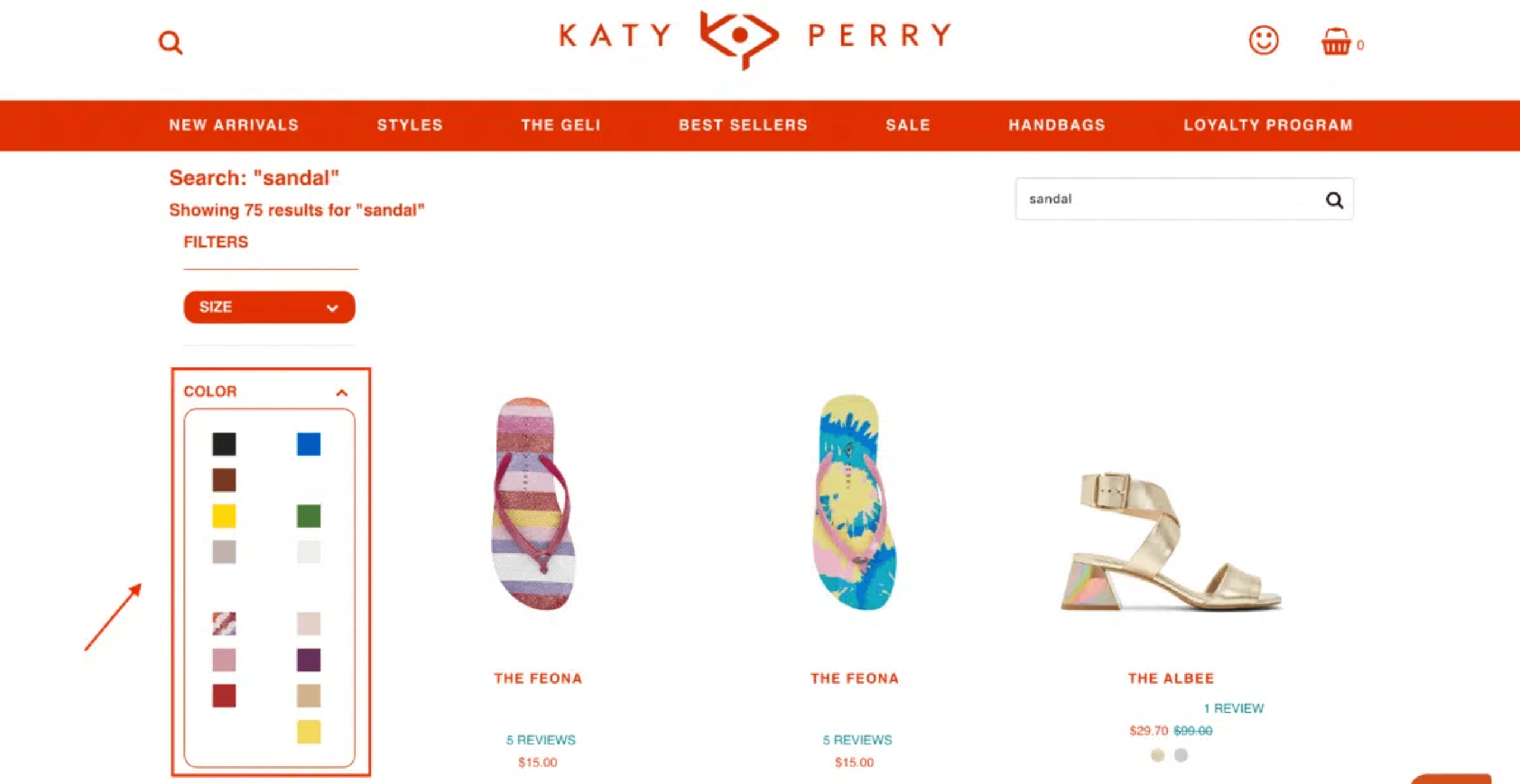
Use image facets: sometimes it can be tough to describe the filter option values in words → using visual filters.
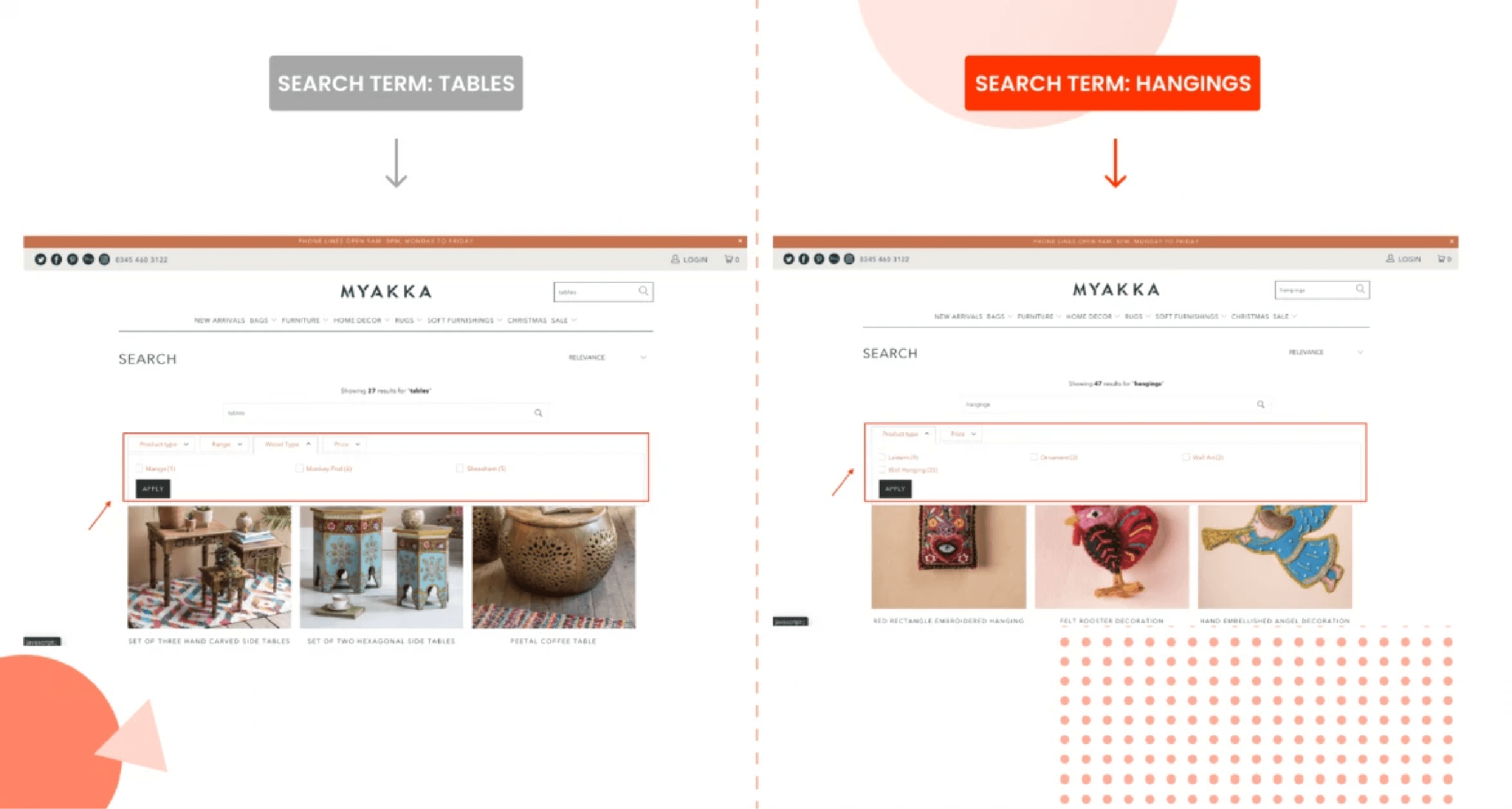
3. Contextual filtering is utilized by many eCommerce sites including Myakka. To be exact, filters are now clearly different and specific to products. Aside from filtering by product type and price, visitors can narrow down the search results by choosing their preferred wood type when they look for a suitable table.
Final Thoughts
Building eCommerce navigation is a great way to make the online shopping experience enjoyable and boost sales. It allows digital shoppers to discover relevant products with ease.
Try a reliable solution like Product Filter & Search by Boost Commerce with a 14-free day trial! Apart from smart instant search and faceted navigation, the app gives online merchants added features such as merchandising, data-driven analytics onsite search, collection filtering activities, upselling, cross-selling, and more.
Using a good online proofing tool will ensure that your team is aligned on the design and positioning of navigation UI assets to achieve the best possible user experience.
Leave A Comment?
GUEST POST
5 Best Practices for eCommerce Navigation 2022
Making your eCommerce site convenient for digital shoppers should be your top priority if you really want to convert visitors into buying customers.


Safeeda MS
Dec 21, 2022


Safeeda MS
Digital Marketing Specialist with hands-on experience in SEO, Content Writing, Google Ads and Google Analytics.
Making your eCommerce site convenient for digital shoppers should be your top priority if you really want to convert visitors into buying customers. Regardless of whether they access your store via desktop, mobile, or tablet, you need to give them a responsive design, and importantly, consumers should be able to hunt out their preferred products within seconds. Hence, your eCommerce navigation must be intuitive and consistent so it causes visitors no frustration.
Why eCommerce navigation? Here are some beneficial impacts that all store owners should be aware of:
A clean and clear site structure creates better UX.
An enjoyable shopping experience that keeps shoppers staying longer in your store to drive more sales.
Improve search engine optimization (SEO), which means your online store will gain higher rankings in SERPs.
And after all, eCommerce navigation will get people to find and buy more products. Now let’s see what it is and how to deploy it effectively.
What is eCommerce Navigation?
eCommerce navigation is such a broad term. Your store is certainly rich in content like product details, purchase history, payment methods, FAQs, contact information, and so on. All of them should be logically placed in a way that makes sense to your customers. This is the purpose of eCommerce navigation. In short, it is all about how you design and arrange your site elements to enhance product discovery and customer experience.
Best Practices to Optimize eCommerce Navigation in 2022
eCommerce navigation has a considerable impact on the shopping experience which contributes to metrics like time on site, bounce rate, conversions, search ranking, and so on.
Make Your Navigation Menu Stand Out the heading is not indicative of what’s to follow
Parent Categories probably a clearer header would work
Designing user-friendly category navigation is the very first step that online merchants should focus on. To do it, make sure that visitors can see your main navigation bar with the parent categories near the top of the page. For those who are not familiar with parent categories, this term refers to an entity used to organize a hierarchy of products. Skincare, for example, is a parent category, while cleansers and moisturizers are child categories.

Positioning the parent categories near the top of every page gives shoppers a directory of various departments of your store. (Source: SourceBMX)
Apart from the position, how you label your categories play a key role in eCommerce navigation. A practical tip here is to make use of keyword research tools like Google Keyword Planner to help you come up with popular search terms to name your categories. The keywords will also give store owners an idea of how to name the navigation bar based on customers’ needs.
It’s like finding the answer to the question: Why are they visiting your site? Hence, the more your site language makes sense to your customers, the faster they find their favorite products, and the higher ranking your site lands in the search engine results page (SERPs.)

Trilogy is a clean and natural skincare brand, founded in 2002 by 2 New Zealand sisters. The products are grouped into different categories so Trilogy decided to use a drop-down menu with the hover effect to avoid bombarding shoppers with too many fields on the navigation bar. (Source: Trilogy)
However, if your store has a large number of products that are divided into various groups, try not to complicate the navigation bar with too many categories. Instead, use the dropdown feature as Trilogy is doing. The dropdown feature is a great way to indicate that there is more to see without cluttering your homepage and overwhelming your customers with too much text.
Introduce Your Subcategories
Aside from the parent categories, don’t forget your subcategories. Let us first define what subcategories mean.
They will allow you to be more specific with some options to save space on your homepage, yet create the opportunity for more time on-site with enhanced click-throughs for better engagement metrics and conversions. A great way to do this is to program the hover method onto your site.

Chewy, a brand for pet supplies, allows pet owners to shop by pet type including dog, cat, fish, bird, small pet, reptile, farm animal, horse, pharmacy, and pet parents using a dropdown menu. Likewise, shoppers can see an expanded menu showing various products serving their pet’s everyday needs such as food, water, or health supplies when they hover their mouse over the subcategory. Hence, Chewy saves a vast amount of space on its page but still features all necessary items in a well-organized way that is easy to navigate.
Choose A Hamburger Menu On Mobile Devices
Did you know that in 2021, 72.9% of all retail eCommerce is expected to be generated via Mobile Commerce (m-commerce0, up from 58.9% in 2017? M-commerce is no longer a trend, it is a standard so brands should focus on enhancing the user experience on small-screen devices.
When it comes to responsive design, most eCommerce platforms resort to the hamburger menu, which is most recognized by the three horizontal lines. Let’s take a look at the navigation on Yummy Bazaar’s site.

The use of hamburger navigation is to open and reveal several hidden menu options to make your page easier to read and less chaotic on mobile devices. Their layout looks clean and simple without the clutter of three-tiered navigation filled with drop-downs.
Put Your Clickable Logo In The Top Left of The Page
Logo plays a key role in the process of building your brand. However, have you ever thought that your logo is a standard tool that supports your store navigation and is not just for branding? Most Internet users expect and rely on the logo to return to the homepage. Hence, turn it into a Home button by making your logo clickable.

Headphone Zone, a brand selling headphones, earphones, and personal audio products, is an example here. No matter which pages their shoppers’ visit, they will always see a clearly-displayed logo on the top left of the page, and easily get back to the homepage with 1 click only.
Include A Noticeable Search Bar On Every Page

One of the more practical elements to optimize your site navigation is having a prominent search bar on every page for your shoppers to use. Place it prominently at the top of the page toward the center with a call-to-action (CTA) inviting visitors.
For example, ‘What are you looking for?’ like Northern Brewer does. This is a nice touch rather than including just the generic ‘Search’ prompt. Besides, having a magnifying glass for the search box is necessary to make it stand out, particularly on mobile devices.
What else can you do with your search box? Be creative by having it reflect your brand or the array of products that you offer.

Take Dermalogica as a notable example here. The cosmetics brand eases their visitors’ search with autocomplete, which helps customers fulfill their search queries. The autocomplete feature saves them time while ensuring accurate search results so it fuels the probability of more conversions. Another tactic to apply is displaying popular searches or trending items to avoid no products found, and introducing them to what you have. You can also choose to showcase related collections and pages aside from products in the instant search widget as Dermalogica lists out some user guides to retinol.
Use Faceted Search (Guided Navigation)
Faceted search or guided navigation is not something new in the eCommerce game. Basically, this term refers to a filtering feature that allows users to refine search results by choosing from a wide variety of filters for product attributes. Therefore, online shoppers can find exactly what they are looking for faster and more efficiently.
Talking about faceted navigation, brands use facets to describe aspects of a product. Precisely, facets consist of filters made of attributes, which are usually pre-defined, based on each business’s specifics, and arranged into groups. Thus, facets can be used by all of your online store customers, but they are much more important for the ones who use search, as they remove the need for blind browsing.
Here are 3 examples of how you can leverage eCommerce navigation by using the faceted search on Shopify stores.

Mobexpert displays numbers next to facets to show how many products every filter has, both selected and unselected. Hence, it helps visitors to get a broader picture of what they can expect from the product catalog.

Use image facets: sometimes it can be tough to describe the filter option values in words → using visual filters.

3. Contextual filtering is utilized by many eCommerce sites including Myakka. To be exact, filters are now clearly different and specific to products. Aside from filtering by product type and price, visitors can narrow down the search results by choosing their preferred wood type when they look for a suitable table.
Final Thoughts
Building eCommerce navigation is a great way to make the online shopping experience enjoyable and boost sales. It allows digital shoppers to discover relevant products with ease.
Try a reliable solution like Product Filter & Search by Boost Commerce with a 14-free day trial! Apart from smart instant search and faceted navigation, the app gives online merchants added features such as merchandising, data-driven analytics onsite search, collection filtering activities, upselling, cross-selling, and more.
Using a good online proofing tool will ensure that your team is aligned on the design and positioning of navigation UI assets to achieve the best possible user experience.
5 Best Practices for eCommerce Navigation 2022
Making your eCommerce site convenient for digital shoppers should be your top priority if you really want to convert visitors into buying customers.


Safeeda MS
Dec 21, 2022


Safeeda MS
Digital Marketing Specialist with hands-on experience in SEO, Content Writing, Google Ads and Google Analytics.
Making your eCommerce site convenient for digital shoppers should be your top priority if you really want to convert visitors into buying customers. Regardless of whether they access your store via desktop, mobile, or tablet, you need to give them a responsive design, and importantly, consumers should be able to hunt out their preferred products within seconds. Hence, your eCommerce navigation must be intuitive and consistent so it causes visitors no frustration.
Why eCommerce navigation? Here are some beneficial impacts that all store owners should be aware of:
A clean and clear site structure creates better UX.
An enjoyable shopping experience that keeps shoppers staying longer in your store to drive more sales.
Improve search engine optimization (SEO), which means your online store will gain higher rankings in SERPs.
And after all, eCommerce navigation will get people to find and buy more products. Now let’s see what it is and how to deploy it effectively.
What is eCommerce Navigation?
eCommerce navigation is such a broad term. Your store is certainly rich in content like product details, purchase history, payment methods, FAQs, contact information, and so on. All of them should be logically placed in a way that makes sense to your customers. This is the purpose of eCommerce navigation. In short, it is all about how you design and arrange your site elements to enhance product discovery and customer experience.
Best Practices to Optimize eCommerce Navigation in 2022
eCommerce navigation has a considerable impact on the shopping experience which contributes to metrics like time on site, bounce rate, conversions, search ranking, and so on.
Make Your Navigation Menu Stand Out the heading is not indicative of what’s to follow
Parent Categories probably a clearer header would work
Designing user-friendly category navigation is the very first step that online merchants should focus on. To do it, make sure that visitors can see your main navigation bar with the parent categories near the top of the page. For those who are not familiar with parent categories, this term refers to an entity used to organize a hierarchy of products. Skincare, for example, is a parent category, while cleansers and moisturizers are child categories.

Positioning the parent categories near the top of every page gives shoppers a directory of various departments of your store. (Source: SourceBMX)
Apart from the position, how you label your categories play a key role in eCommerce navigation. A practical tip here is to make use of keyword research tools like Google Keyword Planner to help you come up with popular search terms to name your categories. The keywords will also give store owners an idea of how to name the navigation bar based on customers’ needs.
It’s like finding the answer to the question: Why are they visiting your site? Hence, the more your site language makes sense to your customers, the faster they find their favorite products, and the higher ranking your site lands in the search engine results page (SERPs.)

Trilogy is a clean and natural skincare brand, founded in 2002 by 2 New Zealand sisters. The products are grouped into different categories so Trilogy decided to use a drop-down menu with the hover effect to avoid bombarding shoppers with too many fields on the navigation bar. (Source: Trilogy)
However, if your store has a large number of products that are divided into various groups, try not to complicate the navigation bar with too many categories. Instead, use the dropdown feature as Trilogy is doing. The dropdown feature is a great way to indicate that there is more to see without cluttering your homepage and overwhelming your customers with too much text.
Introduce Your Subcategories
Aside from the parent categories, don’t forget your subcategories. Let us first define what subcategories mean.
They will allow you to be more specific with some options to save space on your homepage, yet create the opportunity for more time on-site with enhanced click-throughs for better engagement metrics and conversions. A great way to do this is to program the hover method onto your site.

Chewy, a brand for pet supplies, allows pet owners to shop by pet type including dog, cat, fish, bird, small pet, reptile, farm animal, horse, pharmacy, and pet parents using a dropdown menu. Likewise, shoppers can see an expanded menu showing various products serving their pet’s everyday needs such as food, water, or health supplies when they hover their mouse over the subcategory. Hence, Chewy saves a vast amount of space on its page but still features all necessary items in a well-organized way that is easy to navigate.
Choose A Hamburger Menu On Mobile Devices
Did you know that in 2021, 72.9% of all retail eCommerce is expected to be generated via Mobile Commerce (m-commerce0, up from 58.9% in 2017? M-commerce is no longer a trend, it is a standard so brands should focus on enhancing the user experience on small-screen devices.
When it comes to responsive design, most eCommerce platforms resort to the hamburger menu, which is most recognized by the three horizontal lines. Let’s take a look at the navigation on Yummy Bazaar’s site.

The use of hamburger navigation is to open and reveal several hidden menu options to make your page easier to read and less chaotic on mobile devices. Their layout looks clean and simple without the clutter of three-tiered navigation filled with drop-downs.
Put Your Clickable Logo In The Top Left of The Page
Logo plays a key role in the process of building your brand. However, have you ever thought that your logo is a standard tool that supports your store navigation and is not just for branding? Most Internet users expect and rely on the logo to return to the homepage. Hence, turn it into a Home button by making your logo clickable.

Headphone Zone, a brand selling headphones, earphones, and personal audio products, is an example here. No matter which pages their shoppers’ visit, they will always see a clearly-displayed logo on the top left of the page, and easily get back to the homepage with 1 click only.
Include A Noticeable Search Bar On Every Page

One of the more practical elements to optimize your site navigation is having a prominent search bar on every page for your shoppers to use. Place it prominently at the top of the page toward the center with a call-to-action (CTA) inviting visitors.
For example, ‘What are you looking for?’ like Northern Brewer does. This is a nice touch rather than including just the generic ‘Search’ prompt. Besides, having a magnifying glass for the search box is necessary to make it stand out, particularly on mobile devices.
What else can you do with your search box? Be creative by having it reflect your brand or the array of products that you offer.

Take Dermalogica as a notable example here. The cosmetics brand eases their visitors’ search with autocomplete, which helps customers fulfill their search queries. The autocomplete feature saves them time while ensuring accurate search results so it fuels the probability of more conversions. Another tactic to apply is displaying popular searches or trending items to avoid no products found, and introducing them to what you have. You can also choose to showcase related collections and pages aside from products in the instant search widget as Dermalogica lists out some user guides to retinol.
Use Faceted Search (Guided Navigation)
Faceted search or guided navigation is not something new in the eCommerce game. Basically, this term refers to a filtering feature that allows users to refine search results by choosing from a wide variety of filters for product attributes. Therefore, online shoppers can find exactly what they are looking for faster and more efficiently.
Talking about faceted navigation, brands use facets to describe aspects of a product. Precisely, facets consist of filters made of attributes, which are usually pre-defined, based on each business’s specifics, and arranged into groups. Thus, facets can be used by all of your online store customers, but they are much more important for the ones who use search, as they remove the need for blind browsing.
Here are 3 examples of how you can leverage eCommerce navigation by using the faceted search on Shopify stores.

Mobexpert displays numbers next to facets to show how many products every filter has, both selected and unselected. Hence, it helps visitors to get a broader picture of what they can expect from the product catalog.

Use image facets: sometimes it can be tough to describe the filter option values in words → using visual filters.

3. Contextual filtering is utilized by many eCommerce sites including Myakka. To be exact, filters are now clearly different and specific to products. Aside from filtering by product type and price, visitors can narrow down the search results by choosing their preferred wood type when they look for a suitable table.
Final Thoughts
Building eCommerce navigation is a great way to make the online shopping experience enjoyable and boost sales. It allows digital shoppers to discover relevant products with ease.
Try a reliable solution like Product Filter & Search by Boost Commerce with a 14-free day trial! Apart from smart instant search and faceted navigation, the app gives online merchants added features such as merchandising, data-driven analytics onsite search, collection filtering activities, upselling, cross-selling, and more.
Using a good online proofing tool will ensure that your team is aligned on the design and positioning of navigation UI assets to achieve the best possible user experience.

